Sunday, August 8, 2010

Sunday Morning Trial

Just a quickie, took no time at all. I wanted to try just squeezing out the acid presoak water instead of the salad spinner - leave more moisture in it, maybe that would give more control over DOS. My new suspicion is that I'm being too anal about not having puddles, hence mud. I think that's on the right track. I may do a few other experiments, specifically to leave it wetter and wetter until I see where the mud point is, because I see a direct relationship between more water resident in the fiber and a certain type of more control. Anyway, here's today's.

And yes, I know, same general colors. I'm using up some diluted stocks I have leftover in small quantities. This is more about technique at this point than colorways. But why not try a little variation there too.

Saturday, August 7, 2010

More Space/Handpaint Dyeing Experiments

Okay, some's good, mo's bettah. Experiments, that is.


I wanted to try doing a couple of other colorways, and in the process, keep testing out blending techniques. AND balancing DOS against liquid volume, both of which have to be balanced against the degree of wetness I leave in the fiber before even a drop of working dye stock is added. This will definitely take a lot of experimentation so there's no way I'm working with 4-oz. top lengths at this point. I'm doing 1-oz. lengths. Unfortunately for display or organized storage, those need to be serpentined in thirds AND, of course, you braid them in thirds, so my braids will not have the same appearance of variety that a different length top would give (purely by where a same color falls in the braid).

Eventually I'll have enough of these done so that four or more 1-oz. braids that are compatible can be combined to actually make something with. But at this stage, I'm not caring what might go with what. I'm just after technique.

First, a colorway that's been in my head. This is NOT it! I'm after a depth that just isn't here and my sage green? It got totally compromised and my deep turquoise washed out because that color needs way more time to exhaust than any of the others. However, there's a story behind that called "Could this have become a fire in the microwave?" I need to do this experiment again, except I'll steam it stovetop this time, and for as long as it takes. What I'm after is very different, but hey, I still haven't seen a fiber I'd kick outta bed.


That sage green just totally wiped out. It doesn't come through in the photo at all, but that's only partly camera/lighting. It wiped out.


And back to that peach/coral/watermelon/strawberry color that I gave to Jenny after my spinning group's "Dye Day" a year ago, when I first laid my eyes on a jar of acid dye powder, knowing absolutely nothing (less than now though I can happily say). I absolutely will want to make more use of that color. Here's a stab at it (parts). The yellow was only mixed at 0.3% DOS but dang, I gotta go even lighter with that one, it mounts up!


So the quest goes onward!

Thursday, August 5, 2010

My first space-dyed top

Wooo-hoooo! Another first, meaning that this was intentional, not happenstance out of a mason jar.

Okay, space dyed roving can look gorgeous braided. I fear it's not as pretty in reality as it is in a braid, but undeterminable until it's spun. In any event, this was my first experiment with hand painted (a/k/a space dyed) top. I first did a 2-oz. length of this, then wanted it lighter, so I did another 1-oz. length. Yeah, it's a tad lighter but not enough to where they wouldn't just end up about the same way if all dyed together. I used the same working stock formulae, just a lesser DOS concentration. It didn't make much difference, but at least I know more now than I did when I laid out the first 2-oz. length. Including how to braid a continuous piece. Except this isn't, it's two pieces, and not the right lengths for braiding, so I had to bulldog clip ends together for the braiding, then tuck them in.

So here it is. I only used 3 colors, counting on some cross-over blending. On the 3rd try (a 1-oz. length, different colors entirely), I started getting the hang of this to the extent of discovering some tricks. It won't take long I don't think, to be able to come up with some cool things AND some cool color transition blends. (This is actually a little trickier than I thought.)


Saturday, July 31, 2010

Perfect-For-Me Dye Record Keeper


Now that I'm finally getting my feet wet with actual dyeing instead of just absorbing the gestalt of it, I knew immediately that the one thing I'm going to want is a good record keeping system. In the last couple of weeks, as I've been getting a feel for various GS solids and how they behave, I've kept locks and/or bits of yarn spun from the colors and notes about them on index cards, folded in half with the fiber sample tucked in. That just wasn't going to work, so I switched to 3-ring pages in plastic page protectors with the samples stapled alongside. Well, my page covers were a pretty chintsy quality, so I hit Staples to find better ones. They had a sample book of all their page protectors and there were these amazing business card holder pages!!

ZIIIINNNG!!!

Dang, this setup gives me everything I want.


The business card holder slots are two across, five down on the page. (Formula on the left on the back of a business card with its fiber and/or yarn sample right across from it.) You can make brief notes on the business card under your formula, or you can also reference where more extensive notes are for that color.


2. Colors are easily moved elsewhere on the page, or from one page onto another. Nothing needs to be stapled in, and while the business cards and fiber samples just slip out of one slot and into another if you want, the slots are tight enough so that normal page flipping won't spit out the fiber samples.

3. While I want to see a dyed lock for tip variations, I spun a short length of yarn from each dyed fiber sample so I can see it in yarn form too. There's room for both! Squeeeee!

4. More cool stuff. The center line on the plastic page between the two columns readily folds over (but not enough to interfere with the 3-ring part). So if you want to see one color superimposed over another, you can fold over everything between two pages regardless of where they are in the book, and see the bottom color showing through, and how it goes with the top one.

Here's blue over a green page that was 2 pages back


Here's that same blue over a gold page that was several pages back


Fortunately I'd kept a stack of outdated business cards. I now wish I hadn't thrown the whole box of 500 away, but business cards just aren't hard to find.

For now I'm using three 1/2" binders - one for GS dyes only, one for all other brands, and then a third one for CMYK match tests, wild hair ideas and even dye mixing errors--the good, the bad and the ugly.

I can already tell, this dye log format is just going to work really well for the way I do things. And maybe something similar would for you too! There were other formats, I think 4x6 or 3x5... for sure, one had 2 pockets per page. Those could be good for a narrow but long strip of a multi-colored roving.


So that's my new find of the week.
:-D

Tuesday, July 27, 2010

First CMYK Match Experiment

I finally got around to mixing what I'm starting out with as primaries for this purpose, so I can start testing formula matching. Several other people are attempting to do this as well, but so far I haven't found anything that improves on what I worked out. Several variables have to be ironed out still, but I'm more than happy with my first test.

I picked a deep wine plum because I thought it would reveal some likely glitches. I absolutely got the same tone/hue as my target color, but I need to tweak DOS. My target was the 2nd swatch from the bottom, and my fiber is actually a perfect match for the next shade down in this family, but that is minor.

I photographed it in different lighting and from different angles since seeing any color/hue on a monitor is iffy, at best. I'm sure I'll run across color families that won't be so cooperative, however I'm very happy with this first test.


Saturday, July 10, 2010

Some Initial Dyeing and Color Blending Experiments

While I drove people nuts with questions on Ravelry's Love To Dye thread last October, it wasn't until just this last 2 weeks that I actually made up some 1% dye stocks and started tinkering. I have a mishmash of dyes at this point -- about a dozen Country Classics, about a half dozen Cushings and a whopping 2 Jacquards.

I've always hated purple. Ditto hot pink. Something weird happens when you get into fiber though. Suddenly colors take on a new life. I'm now actually intrigued with purples. But only blueish purples. I still can't find love in my heart for reddish ones. And there's a particular color of purple that's in my head and I rarely see. It straddles blue so closely that it's a really fine line.

In search for it, the two Jacquards I bought were Purple and Lilac. I figured one of them would make a close base. In searching for the perfect shade, and to see how other colors might come into play in getting it, I've been test dyeing candidate additions in 20g lots of Romney locks. 1% stocks, and starting with 1% DOS. I did one blue at 2% and the Lilac at 1.5%, 2% and 2.5%. At some point I'll stab at mixing for it, now that I'm getting an idea of the colors I'm working with.

Also, while I do love combing because I tend to spin worsted, as long as I'm experimenting, I've been making friends with my drum carder too. Finally! Not just to see if I can spin more woollen, but also as a tool for color blending.

The fun of "surprise mason jar dyeing" notwithstanding, the beauty of working with 1% stock solutions is that you can dye on a moment's notice because there's no powder mixing PITA setup needed. Second, controllable and precise color mixing. But also, repeatable results. And I reeeeally want that shade of purple that's in my head.

Here are some random, related colors, the idea being to see what I had to work with in terms of DOS at "some" given stock strength.


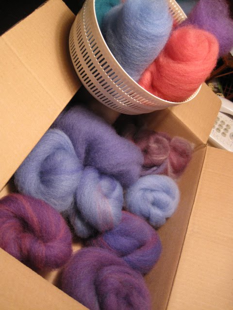
In comes the carder. A couple of the bird's nests are my first stabs at color blending on the carder.


Focusing a little more on that side of the box...


And one of them, closer...


So I could see right away, I need to do a LOT of experimenting because I got different results loading an accent color through the carder's feeder slot vs. streaming it right onto the big drum. And there's a very fine line between overblending which gives nothing more than a new solid -- and stopping at the point where you have a heather. And also how to get spot color.

So that's what I'm starting with, just the typical beginning stuff.

What I really have some surprised joy about is that the Jacquard "Purple" (which produced exactly the shade of purple I still hate) gave me something I'm in love with! I used it as a base for my first (throwaway) blending test. I added some white, some baby blue, and then I got a little more aggressive and loaded some hot pink directly onto the drum. And that's another color I'm not in love with. I mean, Cushings named that dye "Cherry Red" and dammit, it's fuschia! Hot pink! Why didn't they just name it Fuschia? But it was high contrast, so I figured it would be a good choice for trying to get spot color.


I decided to spin it up, just to see how this would look in yarn. As I was drafting, my disappointment was growing because it seemed that any colors in the blend that had some distinction in the mini-batt just got mudded in the drafting -- to whatever extent they hadn't in the carding blending.

So fearing all I'd get would be mud, I spun about 6 yards, then plyed it. I thought MAYBE, just maaaaybe this would have some character as yarn, even though it wasn't what I was after at all. So I knitted a tiny swatch just to see what I got.

The hot pink did actually come through as a distinct color. Sort of. HOWEVER!!!
What surprised me totally was that I took the swatch outside and impaled it onto a nail so I could see it in better light, and OMIGOD, to heck with the pink part. I was smitten by the more solid sections at the top and bottom. This came out a really gorgeous wine shade. Not "purple." It's a color I don't think I've seen in yarn shops because I definitely would have noticed it. I think I'd have bought it.


So now, in addition to the magic purple I'm after, what I'm also now after is finding out how to get that same heathered wine shade again. I think I know what I used, but how I used it, not sure. And how much of it I used, doubly not sure. But also, I want to figure out how to get little spots of color here and there (I mean almost FLECKS!) against an otherwise heathered background. This pink presence

This is going to take tons of experimenting. Tons! Not only in the dyeing, but separately, in fine tuning the blending process on the drum carder. If there were a class around, I'd be having at it. But I don't know of any.

So goals:
1. Find the magic purple formula!
2. Be able to reproduce that wine color with a heathered texture;
3. Find how to create another color that was magic -- some sort of coral/salmon locks that I stumbled into last year at Dye Day (and gave to Jenny with great sacrifice, because as much as I liked it, she was almost crying with love for it. It just had to be hers.) But I think I can reproduce it from memory. The above includes a mini batt of my first "ground zero" stab at it. I think I know where to go from there.
4. Learn more about blending on the drum carder --
(a) to get "flecks" or inklings of color against a steady background;
(b) to get a true heathered yarn;
(c) to create new solid colors from blending

Friday, September 11, 2009

Attempt at "Periwinkle," whatever that means

5 oz. scoured fleece from Romney Ewe #1 -- (Lydia's flock in Newbury, MA). I had pulled it into locks at this point. Dey so fluffy... (sqwunch, sqwunch)


The locks, now dyed. (This was as "Periwinkle" as I could get as a beginning dyer - the tips didn't strike that well, but that may just be the nature of raw lock tips. They lightened the intensity of the yarn a tad, but not that much.)


Locks separated and organized by length, all ready for combing


About a comb load's worth. Though Lydia bred out a great fleece flock, her pasture was very muddy with lots of twigs and other matter, but all that falls out in the combing. Sure makes for a dirty floor though ;-) After combing waste, I'm averaging about a 6-gram sliver...


Poof! This stage always amazes me. How those scoured, dyed and otherwise "handled" locks can open up this nicely. I could just bury myself in fresh-combed poofy fleece!


A fully combed load (4 passes) being dizzed off into a fat, airy sliver. (It's way fatter than it looks, I'm guessing most are between 4-5 inches in diameter.)


That sliver now being wrapped into a bird's nest. (This nest I wrapped pretty airy, sometimes I pull them taut as I go. Either is perfect for spinning from though.)


I didn't take photos of the spinning, but you know what a bobbin of spun single looks like. The one thing that I originally had trouble with was plying on my wheel. I was doing that step on my plying spindle but then discovered a somewhat unorthodox way of doing it, and hey, it comes out evenly so I ain't gonna fix it! So here's the freshly plyed yarn, skeined, soaked to set the spin and then a good whirrr in the salad spinner. It's now drying outside (yeah, right in the sun, I'm impatient.)

These next photos represent the color I was after but the actual yarn is not as lavendar-tinted. Quite more subtle, actually.


On its way to becoming a "Finished Object." I LOVE that center-pull ball winder! I've been winding by hand, and this is just soooo much nicer to pull from.


Edit 9/29/09
I left this post at that point up to now on blog, since this was to be a present for my sistah. I've already gifted it to her though, so here's her finished mitts after a final post-knit bath. This was a "heavy-worsted weight" grist spin, knit on size US 7 needles so they took a couple days to dry because they're thick enough to be nice and toasteee. Sistah said she WUVES em! Awwwwww. On my monitor, this looks more intense or deeper than the actual DOS (depth of shade) but the color tone is reasonably accurate. I'd say it came out reasonably periwinkle, eh?